Today I will be researching different Mastheads and what they mean for magazine so I can use these as examples for when i make my Masthead and cover.

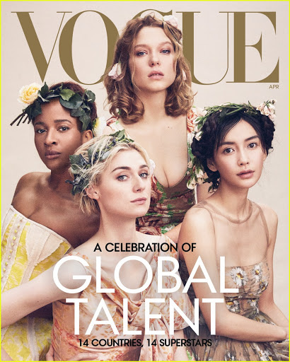
Vogue means fashion in French and the serif didone font in the masthead nods to the sophisticated and elegant style of the magazine. The capitalization of the masthead connotes seriousness and professionalism while the curved lines in some letters like O and U represent femininity and lux. This relates back to the target audience as they are most likely middle to high class women who are aspirers or mainstreamers seeking for style and fashion. The variation of thick and thin lines suggests that Vogue can be bold but refined at the same time.


Glamour means attractiveness and this magazine was specifically made to appeal to a young teen female aspirers. The masthead was originally in bold sans serif font which seemed simple and sophisticated. It occupied about ¼ of the cover which showed its importance. The feminine image was also created due to the bright pink colour. It was certainly eye catching and the all cap lettered masthead stood out as one of the more girly types of magazine.
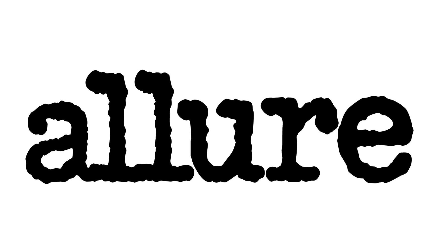
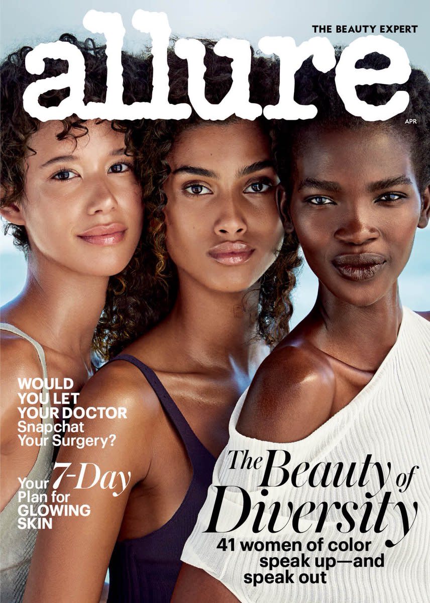
The jagged and imperfect lines in the masthead’s font suggests cultural diversity and that people don’t need to be perfect in order to feel beautiful. The content of Allure also contains humor so the chunky font adds to the casualness of the magazine, making it approachable to a variety of audiences. Furthermore, the bold font and large size of the masthead display their confidence and empowerment.


No comments:
Post a Comment